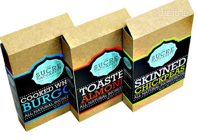
Below is a range of packaging that has a clear brand identity, this is obvious through the large logo, use of same materials for the packaging and the labels have the same structure. However, I also think it is clear to distinguish between the different flavours and products thanks to the different, bold colours used. The typography is also an important factor is this design, needs to be clear and easy to read.
 Using the type to create a strong illustrated piece really makes this piece of packaging stand out. For my design practice I am more about making images talk for themselves with type being a secondary factor however I can still really appreciate this piece and its beauty. I also think the colour palette works well here, shows you don't have to have a limited palette for it to look sophisticated and fresh.
Using food as the imagery has always been an interest for me and I love how these products work. I think they all work well, even the pear one where the designers have cleverly made the bottom half still look different so it fits in with the rest of the range. I think this shows that the food can sell the product as long as it looks professional and simple. I want to keep this in mind when I am designing my pasta range.
 Using a standard font, label net and layout is enough to make these products into a range. I think the is a good balance between the type and imagery, for me this will be one of the hardest aspects to get right in this new brief.

No comments:
Post a Comment